Turn It UP paragraph
Turn It UP is the most respected weekly music magazine in the world. It's weekly issues give its readers the most exciting coverage of the very best in new music, including features, the latest releases,from a range of genre;s such as Hip Hop, Pop and R&B and has and age range of 13-20 year olds, as well as a regular look at a fashion dominated culture. The mixture of both these elements give it's readers a know all perspective in music and fashion and is the most popular magazine of it's kind.
Tuesday, 11 December 2012
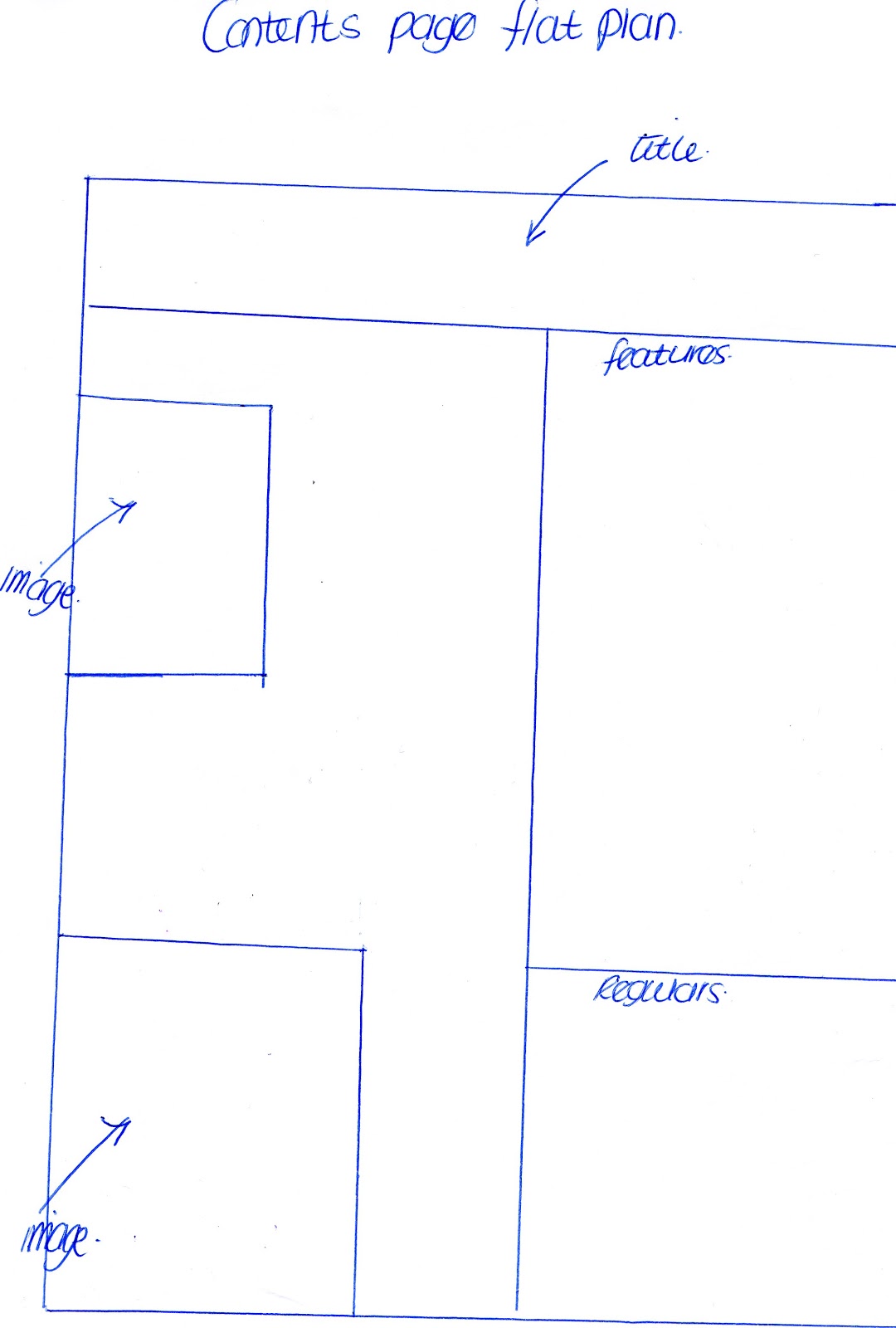
Turn It UP regulars and features.
10 minutes with the editor
This weeks Top Tweets
Horoscopes
Gigs and events near you!
Whats hot this week (TV, CD's, Music videos)
This seasons must have buys
fashion 101 with our style editor
Hair hell to Hair heaven
Street style
10 minutes with...
Turn it up on this weeks celebrity gossip
Competition time
Features
Artist on the front cover interview
WIN TICKETS TO SEE BEYONCE
Nicki Minaj tells us why she's the Queen B
On tour with Olly Murs
Spend this Christmas in style
Rihanna talks, tours tears and tantrums
Most memorable pictures from 2012
Regulars
Celebrity circle of shame10 minutes with the editor
This weeks Top Tweets
Horoscopes
Gigs and events near you!
Whats hot this week (TV, CD's, Music videos)
This seasons must have buys
fashion 101 with our style editor
Hair hell to Hair heaven
Street style
10 minutes with...
Turn it up on this weeks celebrity gossip
Competition time
Features
Artist on the front cover interview
WIN TICKETS TO SEE BEYONCE
Nicki Minaj tells us why she's the Queen B
On tour with Olly Murs
Spend this Christmas in style
Rihanna talks, tours tears and tantrums
Most memorable pictures from 2012
Magazine Interview Questions
Here are the questions that I will include in my interview with my artist.
You went on tour for a while, what was the best thing about being on tour?
What was the worst thing about being on tour?
Do you miss anything about being at home?
How long did you know that you wanted to become a singer?
When you were growing up who in the industry was your inspiration?
What genre of music do you listen to most?
What's the craziest thing you have brought?
What has been you most diva moment?
Who is your celebrity crush?
If you could collaborate with any artist who would it be?
What is your must have clothing item?
Has fame changed you and anyone else's attitude towards you?
What is your most listened to CD in your car?
When did you first find out you had a singing talent?
Would you prefer to have a high profile relationship or to be with someone who isn't in the public eye?
If you could sum yourself up in three words what would they be?
If you could sum your fans up in three words, what would they be?
Music Magazine mood board

Here is my Music magazine mood board. I have taken pieces i like from various music magazines such as Q, Vibe and NME. I have chosen elements that i think look good and stand out to the reader. I like the way that Vibe magazine set out their contents page title, and I think it is something that I will take into consideration when i make my contents page. I have also chosen various artists for the fact I like the way that they have been positioned on the cover page, such as Lady Gaga's pose and the fact that Kanye West is in black and white to fit in with the colour scheme of the contents page. I have also chosen the part of the contents page from Vibe magazine in the top right hand corner. I have chosen this because I like the font that it has been typed in. In the bottom right hand corner i have chosen a title from Q magazine. I like the colours such as the white and red with the Adele title. I also like the lighting in the image of Kelly Rowland.
Photo shoot test shots:
Here are some test shots that I have done for the article in my magazine and the cover page. I'm not sue whether or not I will include some of these images in my music magazine.
 I think that this shot works well, I like the effect that it has with her hair flying back on it.


Here are some test shots that I have done for the article in my magazine and the cover page. I'm not sue whether or not I will include some of these images in my music magazine.


I also like this shot however not for the front cover of my magazine. I think it would look good on the double page spread article that will be included.

I like this shot however I don't think it works as well as the other shot. I think this is because of her positioning and the pose that she is in.

I don't think this shot would work in my magazine. I don't really like the pose she is in as it looks very plain.
Wednesday, 28 November 2012
Magazine Cover analysis

Cover of Q magazine:
On the front cover of Q magazine they have chosen to have the lead image of the artist as him in a powerful stance, this I think works well with the cover line 'I always think big'. I think this reflects that as the word 'big' is associated with something powerful and hard therefore having the artist in this pose is very effective. Also in the lead image the artist looks quite angry and harsh looking, this I think links to the cover line 'Get Oasis back together? Not even for starving children' This works well because that statement could be seen as harsh. The fact that he will never get the band back together even for starving children shows that it is very unlikely to happen and reflects the artists feelings.
I like the way that Q magazine have chosen to place their features on the front cover, in the left third. I like the way that it is sort of a flash box that stands out to let the reader see the main articles that will be in that weeks issue. They have done this to make the features stand out more as the features are what draw the audience in and make them want to buy the magazine.
Based on the pose and the cover lines the artists has been chosen to be portrayed in kind of a negative way, he is being represented as a harsh character.
I think the magazine is aimed at a more mature target audience due to the colour scheme and the articles that the magazine has chosen to feature in that weeks issue.

Contents page of Q magazine:
I really like the contents page layout of Q magazine. I like this as I haven't really seen double page contents page and i think it looks quite effective. I think it looks effective as the reader is able to clearly see what is going to be in the magazine. I also like the fact that the contents page has small images around the titles of the articles. I like this as it links well and gives the contents page a good overall look. I also like the way that the cover story has it's own box in the left hand corner of the first page. I like this because the cover story is what will make most reader pick up the magazine and therefore it makes it more noticeable.
I like the way that in the bottom right hand corner of the second page it has a box that shows you how to subscribe to the magazine. I think this is really important and will most likely include this on my contents page.

Double page spread of Q magazine:
How is the artist represented?
I think the artist (Ellie Goulding) has been portrayed as quite innocent and vulnerable in the image on the left, this has been done to link to the cover line 'It hurt when people thought she was a product of the Brit school...' This has been done to show the fact that the artist is upset and hurt, i also think this has been portrayed in the facial expression of the artist as she looks upset.
I like the way that this double page spread has been set out. I like it because i think the image of the artist that takes up a full page is very effective and looks good. I also like the way the text has been set out including the big 'I' and 'W' to start off the paragraphs. I also like the position of the images included on the right hand side page, I like them because they do not intrude on the text and also link to what the article is about.
I think the colour scheme of this double page spread also works well with the colour scheme of the contents page and the cover page because it includes black and red.

I think that the cover of Kerrang magazine is very vibrant and distinctive looking. I think this because of the colour scheme used on it and the fact that Kerrang magazine is well known for the font they se on their masthead. This is very helpful because when designing my magazine i will try and make my font look distinctive and noticeable to draw in the readers.
I like the flash box that states '10 EPIC POSTERS!' this is really noticeable and the fact that it is bold and capital letters makes it like this. This has been done to let the readers know that there is a free things in the magazine such as the 10 posters.
The yellow writing on the cover is very clear when on the lead line 'Bring me to the Horizon' which is also the name of the band. This is good as it makes the cover story stick out more to the eyes of the buyers.
I also like the fact that there is a flashbox in the bottom of the right hand side. I like this as the white and black colour scheme is very clear to make the fact that there you can win tickets to a gig from this magazine very noticeable. This is a good idea as it will make more people want to buy the magazine for a chance to win some free tickets.
The use of the cover line 'The secrets behind 2013's most wanted album' links to the lead image as the artist is covering their mouth with their finger in a secretive way. I think this is effective as it makes the cover look interesting and makes the reader want to read more.
Also i think the band have chosen to be represented in a fun way due to the nature of the lead image.

I like the contents page of Kerrang magazine. I think it is effective the way that they have used the distinct font for the headline of the contents page and have stuck to the yellow black and red colour scheme.
I think that the use of a flashbox to introduce the readers to another competition to win a meet and greet with Parkway Drive is effective and the fact that there is a big image of the band that takes up most of the contents page shows that the reader cannot miss it.
I like the way that Kerrang magazine has the space at the end with a letter from the editor, many magazines include this and i think it gives the reader a link to the editor of their magazine.
Kerrang magazine have chosen to place the text on the left hand side. I like this although i think that the features could be placed better so that they stick out more however the colour scheme is good at the use of yellow on black is very vivid.
Kerrand magazine have a lot of competitions such as the way that they have decided to let the readers get a pair of headphones when subscribing to their magazine. I think this makes the magazine seem to be aimed at a more teenage audience due to the types of articles and free thing available such as posters.

Double page spread of Kerrang magazine:
The colour scheme of the DPS of Kerrang magazine allows the artist to stand out against the yellow colour with his dark clothing. Also the blue is effective against the yellow, as is the black. The pose of the artist links to the information that says 'roars competition' This links to it as the pose he is in is roaring and therfore makes him look sort of animalistic.
I think the band again is represented in a fun way as the pose of the artist is not too serious and gives it a happy feel.
This again linking to the fact that i think it is aimed at a more teenage audience due to the colour scheme and nature of the articles used in this double page spread.

Front cover of NME magazine:
NME magazine looks to be aimed at a more mature audience. I think this because of the colour scheme used (red,black and white) I also think this due to the artists featured in the magazine and the pose of the artist in the lead image.
I like the way that the lead line has been positioned and the colours that it is written in. I like this because the red sticks out against the dark clothing of the artist as does the white.
I like the fact that the cover lines have a black bold line underneath them as i think this draws your eyes to the writing.
I think this magazine would be noticeable on a shelf due to the white becakground and the intensity of the lead image.
How is the artist represented?
The artist is represent as very upset or 'glum' on the front cover. This is clear from the lead image in the way that the artist has his head in his hands and the facial expression that he also has.
This links to the lead line 'WHAT'S EATING MARK SKINNER' and 'WHY SO GLUM' this is very effective and the use of words in the lead line are also effective as they would make the readers want to find out what is wrong with the artist.
The 'posters inside' at the top is italic and is also in red which makes it noticeable to the buyers.

Contents page of NME magazine:
The contents page of NME magazine has been set out mainly using pictures and not much text. In a way i like this as you can get a feel of the artists included in the articles and what the articles will be about. I think they by doing it this way though NME magazine have taken the reader away from the features and that i think is waht draws the attention of the buyers and maked them want to buy the magazine.
Also the cover story is not very noticeable on this contents page.
However i like the way that the subscibe box is in red as it sticks out and is in a bold colour. This drawing the attention of the readers.
I also like the way that NME have stuck to the colour scheme and i think it looks like it is aimed at a more mature audience due to the way everything has been presented to the readers.

Double page spread of NME magazine:
The image of Mike Skinner in the DPS of NME magazine is very simple. This links to the headline 'don't mention the streets' It links because the pose that the artist is in is that he doesn't want to listen and the fact that it is saying don't mention it reflects this.
The colour of the headline also links to the image as it is in the same colour palette ad therefore looks correspondant to the image and the text of the article.
I like the way that the image on the left takes up a whole page as it looks important and also looks effective as the image is quite intense.
The fact that some of the text has been highlighted in red draws the readers attention to those word which again i think is very effective.
The artist has been represented in a child like way in the fact that when a child does not want to hear something they may put their fingers in their ears. This is effective as it is quite hypocritical to the target audience of the magazine (being a more mature audience)
The clothing the artist is wearing also links to the article as it states' I always liked suits' and he is wearing a black suit. This i think also links to the mature audience the magazine is aimed at.
Audience Profile

Here is my audience profile. I plan to aim my magazine at one of these genres of music (pop or hip hop) and aim to draw attention to the part that the audience has highlighted (lead image)
Monday, 19 November 2012

Monday, 12 November 2012
Sunday, 11 November 2012
Magazine Analysis.

For my magazine analysis i have chosen to look at the cover of vibe magazine. Vibe magazine is of the R&B and Hip Hop genre of music. On the cover is Ciara and the lead line states 'NEW MUSIC NEW BODY NO BOW WOW CIARA DON'T YOU WISH YOUR GIRLFRIEND WAS HOT LIKE ME?'
I think that this lead line has been portrayed in the picture of Ciara as she is wearing tight fitted clothing that will show her figure off, also she is standing in a position so that the reader can see her full body shape.
I think that this the artist was looking to be represented as having a new image and the fact that there is no props in the picture and just a blue background gives her a free feeling which i think links to the lead line 'No Bow Wow' who she is not with anymore.
I think that this would appeal to the audience as she fits in with the genre of the magazine (Hip Hop and R&B) and also i think the positioning of Ciara and the lead line may appeal to the male audience whilst also appealing to the female audience.
Wednesday, 24 October 2012


Thursday, 18 October 2012
Sunday, 16 September 2012
CD Cover research

Rizzle Kicks Prophet single cover
Photography:
I like the photography on Rizzle Kicks single cover as the forefront picture without the editing of the light movement is quite a simple picture and i also like the background building as i think it looks good against the night sky.
Use of colour:
The use of colour on this cover is good as the white text of the band name sticks out against the dark background and the use of light movement looks very effective also against the dark background.
Title and Imagery:
The title of the the song is 'prophet' and the use of light movement to create a devil and an angel is effective as a prophet is someone who is said to have been contacted by the supernatural, therefore the title and cover link very well.
I also think that the light of the background building and therefore the sky being lighter on the side of the angel and the darker side of the background being behind the devil is interesting and also links to the image because angels are associated with being light and good and the devil is associated with being dark and bad.
Font:
I think the font on this cover sticks out as it is big and bold at the top and the fact that it is white against the dark background also makes it more noticeable. This would be a good thing as if it were on the shelf people may notice it more.

Ed Sheeran + Album cover
Use of colour:
The use of colour on this album is good as Ed Sheeran uses orange on all of his artwork so people may be able to easily associate the orange colour with one of his CD's.
The white against the orange is also effective as the white is very noticeable against it.
I also think they colours are good as they are vibrant colours that are noticeable.
Photography:
The use of the photography on the cover is good as it is simply Ed Sheeran's face.
Appropriateness for the genre of music:
I think the cover is appropriate for the genre of music because it is a very simple cover and Ed Sheeran's music is quite simple and calm, therefore not having an overcrowded and in your face cover is very good as it may give the listener an idea of his music.
Text:
The text on this cover is also very simple as it is just '+' but i think it is effective because it is quite different to other covers.

Photography:
I really like the photography on this cover as it has been edited to looks quite fuzzy and old creating a good effect, I also think this is good as it links to the theme as her hair looks as though it has been styled quite old fashioned.
Text:
I think the text on this cover is quite big and bold, yet on many female artist covers the writing is very thin and feminine looking and this is not, making it different.
Use of colour:
I like the use of colour as they are simple colours like back and white but also have a shade of red in them.

Nicki Minaj 'Pink Friday Roman Reloaded' cover:
Photography:
I like the use of photography on Nicki Minaj's CD cover as her face stands our as the background has been blurred, this I think is effective as it makes her more noticeable.
Appropriateness to genre of music
I think this cover is appropriate to the genre of music as her music is quite out there and in your face and the cover is bright and colourful which i think compliments this.
Use of colour:
I think the use of colour on this cover is effective as the title of the album is called 'pink friday...' and there is a lot of pink and girly colours on this linking to the title.
Text:
I think the use of text on this cover is interesting as the word 'pink' is in a very feminine font compared to the rest of the text. I also think the text is interesting as due to 'roman' being her alter ego, the word has been written in a very masculine and tough font yet still being in the feminine colour pink.

The Weeknd 'Thursday'
Photography:
I really like the photography used in this cover as i think it is really interesting. I like the fact that they have used three portrait pictures on it. I also like the fact that it is called 'Thursday' and on Wednesday she looks like her normal self, on Thursday she is dressed up for a party and on Friday it is the morning after.
Use of colour:
I like the use of colour on this cover as i like the fact that there is a colour pallet on the top with the shades of colour that have been used in the photography such as the yellow and the red. I also like the fact that the Wednesday is in black and white, Thursday in bright colour and Friday in a gloomy shade, this could be reflecting the mood of the girl on the cover, as well as being able to tell from her facial expression.
Text:
The use of text on this cover is effective as the title is bold and noticeable against the white background, also i like the fact that although Thursday has not been written on the cover you can still tell that the middle picture goes with that day. Also i like the fact that it has been made to look like the days of the week have been written above the picture instead of being typed onto it.
Subscribe to:
Comments (Atom)